
You are using an out of date browser. It may not display this or other websites correctly.
You should upgrade or use an alternative browser.
You should upgrade or use an alternative browser.
Thorpe Park | Hyperia | Mack Hyper Coaster | 2024
- Thread starter Matt N
- Start date
-
- Tags
- 2024 new coaster thorpe park


davidm
Strata Poster
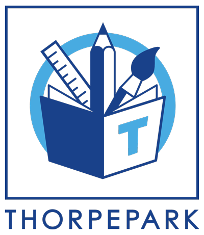
Well at least its different to the others.... ")
(http://www.thorpepark.org.uk)
--
(https://thorpeparkacademy.org.uk/)
--

(https://www.thorpeparkhotel.co.uk/)
--
Hotel's one is the best I reckon.
(http://www.thorpepark.org.uk)
--
(https://thorpeparkacademy.org.uk/)
--
(https://www.thorpeparkhotel.co.uk/)
--
Hotel's one is the best I reckon.
Last edited:
Fleetwood_Mack
Mega Poster
I'd say "I see what they were going for" but I can't even see what they were going for.
I'veGotFourB&MsInMyGarden
Mega Poster
Such a downgrade from the iconic Infinity logo. This is so generic and lifeless. Maybe it'll grow on me but I really doubt it.
Projektion
Mega Poster
I mean the logo itself is fine... but for a theme park? err...
It looks like a rent-a-car logo or something.
It looks like a rent-a-car logo or something.
Tonkso
Hyper Poster
Oh, okay. I'm kind of inclined to stick up for new logos and whatnot as they almost always get slated, but it looks something off a bike rental shack. I'm sorry but whilst I understand the global graphic design trend towards simplification (which is driven guy mobile Web and app design) but this is a theme park, be a little bit playful.
Edit: I saw a tweet which suggested it looked like something that was designed on The Apprentice, I hate to be mean and negative I truly do, but I'm inclined to agree.
Edit: I saw a tweet which suggested it looked like something that was designed on The Apprentice, I hate to be mean and negative I truly do, but I'm inclined to agree.
emoo
Hyper Poster
Unsurprisingly disappointing. Looks ok on the one poster I've seen it on I guess 
Wary of how it will look on the parks road entrance on the faux track. I could adjust to a large 3D sign with individual letters if done well but will crap over a billboard.
Not altered any intentions for visiting and riding Hyperia asap, and won't suddenly make me buy merch again.
Wary of how it will look on the parks road entrance on the faux track. I could adjust to a large 3D sign with individual letters if done well but will crap over a billboard.
Not altered any intentions for visiting and riding Hyperia asap, and won't suddenly make me buy merch again.
JoshC.
Strata Poster
The park have discussed more here about the rebrand: https://www.thorpepark.com/rebrand/
I prefer the infinity logo, but I see what they're going for. I like the brand ideas and message they're going for. Give it a few months and people simply won't care about the logo.
I prefer the infinity logo, but I see what they're going for. I like the brand ideas and message they're going for. Give it a few months and people simply won't care about the logo.
spicy
Giga Poster
I mean the logo itself is fine... but for a theme park? err...
It looks like a rent-a-car logo or something.
Exactly this.
The logo is getting some serious negative feedback online.
The fact they have hyped it up so much online I don't think has helped it.. A YouTube mini series reiterating the new direction the park is taking, it's a whole new era, with the home of feel good thrills, quoting Maya Angelou etc.. When in reality it's literally just Thorpe Park written in a generic font.
Lukas D
Roller Poster
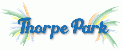
Well, I do enjoy the boldness of the font. And I do enjoy how the font and the colour palette both scream 1979 to me, which is a nice nod to the park's roots.
That's what's really bothering me about this.but the O in Thorpe Park is like a shopping trolley with one skew-whiff wheel
I'veGotFourB&MsInMyGarden
Mega Poster
The logo is fine but I just wish it had something more, it's a bit bland currently. I'm not sure what but for a theme park logo it's definitely lacking that "fun" element, if you know what I mean.
On a more positive note, I think the park's new direction and especially the snippet of soundtrack are pretty good! It's just that pesky logo!
On a more positive note, I think the park's new direction and especially the snippet of soundtrack are pretty good! It's just that pesky logo!
Nicky Borrill
Strata Poster
Struggling to think of positive things to say about the new logo, it's properly bland and boring. I can't see where the actual marketing potential is in it. The last logo had the infinity sign, and they were able to make good use of it all the time. What they gonna do with this one? include a pissed up 'o' on everything?
However, then I remembered the build up, and the 3 part video series, that was actually good fun. So there's my positive comment, the build up was great, the end product not so much.
However, then I remembered the build up, and the 3 part video series, that was actually good fun. So there's my positive comment, the build up was great, the end product not so much.
Dar
Hyper Poster
Yes! James from Team GPTerrific doing his best to defend the version he didn't like but was outvoted.Edit: I saw a tweet which suggested it looked like something that was designed on The Apprentice, I hate to be mean and negative I truly do, but I'm inclined to agree.
I genuinely thought this was a GIF and was waiting for the logo part of the logo to rollercoaster its way behind the lettering!
I don't "get" it. I don't know how I'm supposed to feel when I see it, there's not a lot there to evoke emotion or recognition beyond the quirky 'O'. It's weirdly busy for something so bland.
The new logo is legitimately sh*t.
I think the park itself has been legitimately **** and that’s what they need to move away from.
This is presumably a Hermes -> Evri sort of thing. A wildly new logo to earmark a new era (in which hopefully the whole park doesn’t continue to look like a total dump). In fairness to Thorpe, repainting collosus and retheming ABL is a good start… not that ABL ever looked particularly awful.
I wonder if they can spare the change to give Storm Surge the WD40 treatment and a power wash.
I have no idea what Merlin were thinking with letting these parks / rides get to such a state.
roomraider
Best Topic Starter
I think the park itself has been legitimately **** and that’s what they need to move away from.
This is presumably a Hermes -> Evri sort of thing.
I mean it didn't really work for Hermes/Evri. Everyone just hates Evri instead of Hermes now
