What's new

Thorpe Park | Hyperia | Mack Hyper Coaster | 2024

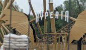
I like the 'look' of the queue area. Don't get me wrong, hate the fact it's cattle pen, but we all knew that was coming... The aesthetics, I actually really like.
I’m the opposite. I mean, obviously I don’t like the cattle pen. Everybody hates cattle pens. But the colors are just so vibrant. It genuinely hurts my eyes. And there’s way too much gold. It looks like a sea of gold. Would it have hurt them to add some other colors?
 
I’m the opposite. I mean, obviously I don’t like the cattle pen. Everybody hates cattle pens. But the colors are just so vibrant. It genuinely hurts my eyes. And there’s way too much gold. It looks like a sea of gold. Would it have hurt them to add some other colors?
I think they’ve gone vibrant knowing all too well that the park is in the UK, and our climate will absolutely dull everything down within a couple of years. As the colours weather they’ll look different.

That being said, I like it now 🙈😂 But fully appreciate that it is not to everybody’s liking.
 
Visually the station/queue area puts me in mind of some gentrified coffee shop in some a**hole corner of London, those formerly "don't go there" areas that suddenly get bought up by poshos and suddenly everything looks like... this. Hyperia looks like it charges £12 for an oat latte. Alongside a variety of "locally sourced" IPAs that will burn your mouth.
 
Last edited:
I’m not too displeased with the overall presentation, personally. Yes, it’s not a heavily themed coaster, and there are definitely things I would change, but I never went in expecting some heavily themed extravaganza to begin with and I think the theming is a more minor element of this coaster than it is for many.

I’m a bit disappointed that they weren’t able to make more of a spectacle of the splashdown, albeit I can see why they had to remove the splash plaza. The queue does not look particularly inspired, but I quite like the gold and I wouldn’t say it looks actively unpleasant in the way that some queues are; it doesn’t appear to have as much of that “caged in” feel as I’d initially feared. While not spectacular, it looks OK and gets a pass, in my view. I don’t dislike the station, I think the entrance arch and such look quite nice, and overall, I think the area will look nice once some more of the landscaping has gone in and grown. It does look like Thorpe are trying to make somewhat of an effort with landscaping, with some shrubs and such already having gone in.
 
Visually the station/queue area puts me in mind of some gentrified coffee shop in some a**hole corner of London, those formerly "don't go there" areas that suddenly get bought up by poshos and suddenly everything looks like... this. Hyperia looks like it charges £12 for an oat latte. Alongside a variety of "locally sourced" IPAs that will burn your mouth.
I've been in a number of those coffee shops over the years and I'll be honest I just don't see the similarity. If you painted it all black it would look a bit like Boxpark I guess.
 
More pictures from Jack and his newest vid.
View attachment 31504

Something that made me smile in this image is if you look bottom right you can see the unpainted queueline fencing then under the hyperia sign is a table with can of spray paint and a broom.

Just made me laugh a multimillion pound project and you got a guy just spray painting each fence panel on an old table and brushing them down with a broom.

As far as the whole area goes clearly there wasn't much budget for theming and they have done the best with the small budget. It is a shame the splashdown plaza was scrapped though, will you even be able to see the splashdown effect other than in the queueline?
 
For all we know it's intentional*, just to mess with people - like the choice of painting supports. Its not though is it 🤷 oh well things happen.

* A stylised choice
 
Something that made me smile in this image is if you look bottom right you can see the unpainted queueline fencing then under the hyperia sign is a table with can of spray paint and a broom.

Just made me laugh a multimillion pound project and you got a guy just spray painting each fence panel on an old table and brushing them down with a broom.

As far as the whole area goes clearly there wasn't much budget for theming and they have done the best with the small budget. It is a shame the splashdown plaza was scrapped though, will you even be able to see the splashdown effect other than in the queueline?

It is interesting how Merlins construction stuff is done sometimes. A spray painted part like that isn't gonna hold up and will end up rusting in our climate. Needs to be powder coated.

Same with the Nemesis Reborn queue where loads of the fencing was badly thought out, and some sections on the hills ended up being slightly too low for their health and safety requirements. So they drilled holes in the posts and strung wire through. But without cleaning up the drilled holes or painting the bare metal so those will all rot through in a few years.
 
I'm a bit disappointed the "world first" Outer-banked turn inversion element hasn't been given a better name. In a world with JoJo rolls, banana rolls and dog tongues etc etc I think there should be a better name for it.

I'd suggest maybe sausage roll or an empirical roll as a better name, something to mark that it's in the UK. Does anyone else have any better ideas?
Don't worry the Coasterforce think tank has already been working hard on this:

I think there was more before this too tbh.

Maybe a poll is needed to settle it once and for all!
 
Top